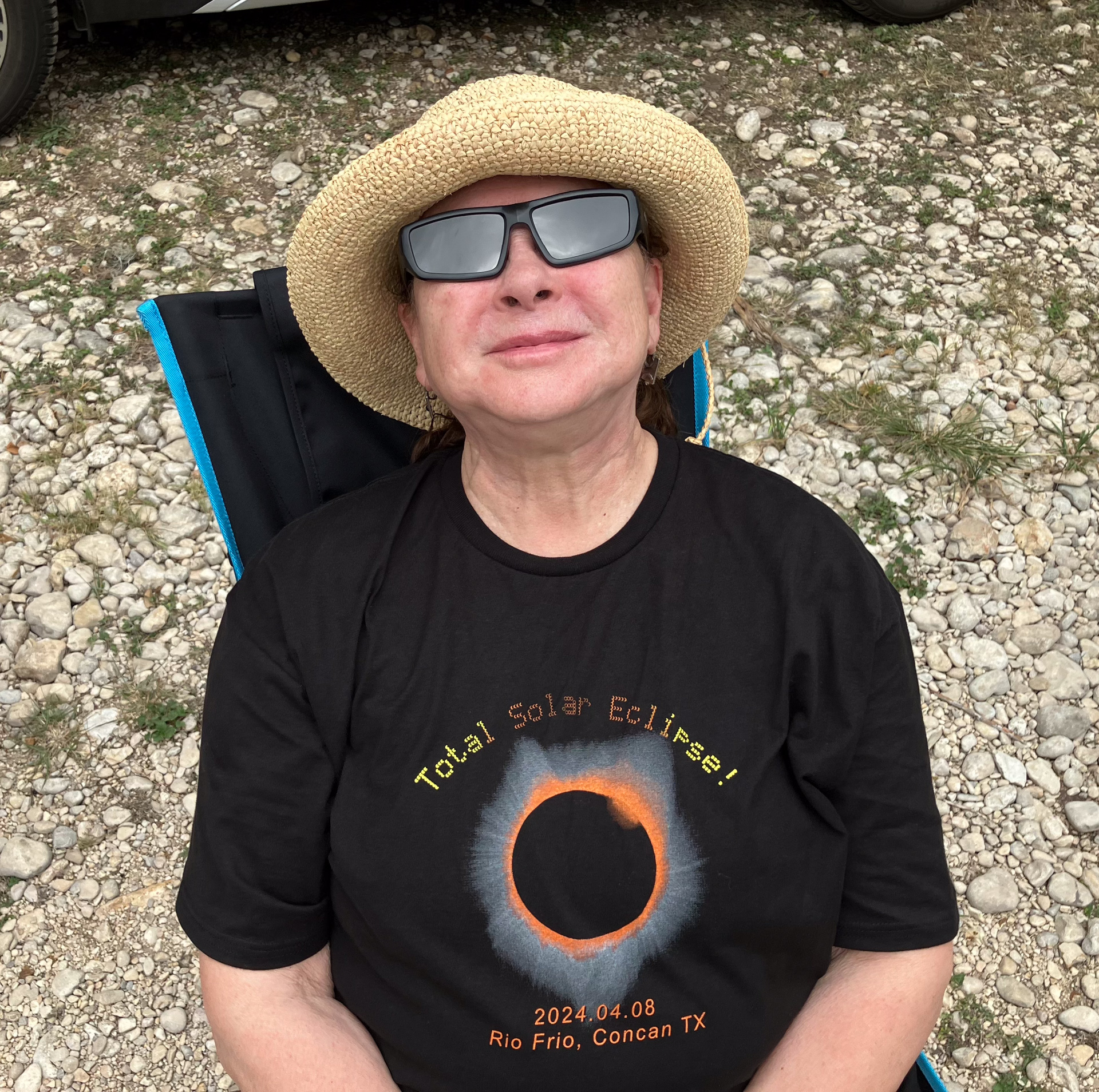
I remembered the excitement at the 2017 eclipse site, of various groups gathered in the campground, enjoying the spirit around the campfires. One of the groups was from an astronomy club, and they had made special eclipse event t-shirts for their members to wear with pride and distinction. When I expressed how impressed I was with the design, the group leader offered to sell me one. I took him up on it and have worn it frequently since.
Seeing an opportunity to do something similar for our group, I put together a design. It was much simpler than the one I admired in 2017, but it featured one of my photos from that eclipse. It documented the time and place of our eclipse party, and it had a banner declaring “Total Solar Eclipse!”. Rather than making it big and bold, I realized that I could use the dot-matrix font of the name projection cards, which tied in the pinhole projection activity nicely. I further realized that I could represent the full progression of the eclipse by evolving the dots into thin crescents, and then back to full disks. I was eventually satisfied with this design and stopped tweaking it.

Now I needed to find some way to get it printed onto shirts. I hadn’t ever done a project like this, but with all the zillions of t-shirts one encounters, I figured there must be some businesses that specialize in it. My concern was that my small print run would not be of interest to them—the setup expense would be too high and the margins too small.
During one of our walks through the neighborhood, Poldi and I noticed a new storefront that had popped up a few blocks from our house, “The Bitter Buffalo”, nestled between Sunbean Coffee, and our local pub, Bull’s Horn. The business tag line mentioned “hand pulled prints”. I looked it up and found that this was a marketing graphics studio, operated by Gillian McLaughlin, a woman who had been making silkscreen prints for decades, and custom printed t-shirts were her biggest product.
My design, a bit unconventional in its use of halftones and graphics, did not phase her in the least. She knew exactly how to make the color separations, but what t-shirt type did I want? This put the task back in my court. She sent me links to her suppliers, and I proceeded to become overwhelmed by the myriad specifications involved in selecting a simple t-shirt. Some obvious ones were fabric type and color. I wanted black cotton, but what about the cotton type, its blend, and what weight? Is it pre-washed/pre-shrunk? Will it accept white ink? Was it made in the US or overseas? In a union shop? And the design features: seamless body? Taped seams? Double stitched? Neck style, torso length, team sport style? Removable tags? The options seemed endless.
In the end, with Poldi’s help examining the details of the various t-shirts we had in our personal lifetime collections, we were able to prioritize the specifications: cotton, medium weight, pre-shrunk. Beyond that, we went with Gillian’s preferred vendor for that combination.
I was worried that I was too late in starting this project—there were only a few weeks to go until we’d be leaving for Texas, but again, Gillian at The Bitter Buffalo was on top of it, fitting my small order in among her other jobs, and alerting me when they were ready to pick up. I was thrilled to see them, and enjoyed touring her studio when I did, days before my deadline.

Thor and Poldi’s Eclipse Party 2024
previous | beginning | next


Pingback: Eclipse Party 2024- name card projections | Thor's Life-Notes
Awesome! I want one! Let me know if you will have any for sale — that shirt will be a good conversation starter, and a great shirt to wear working with horses :)) Dawn
Pingback: Eclipse Party 2024 – photo planning | Thor's Life-Notes